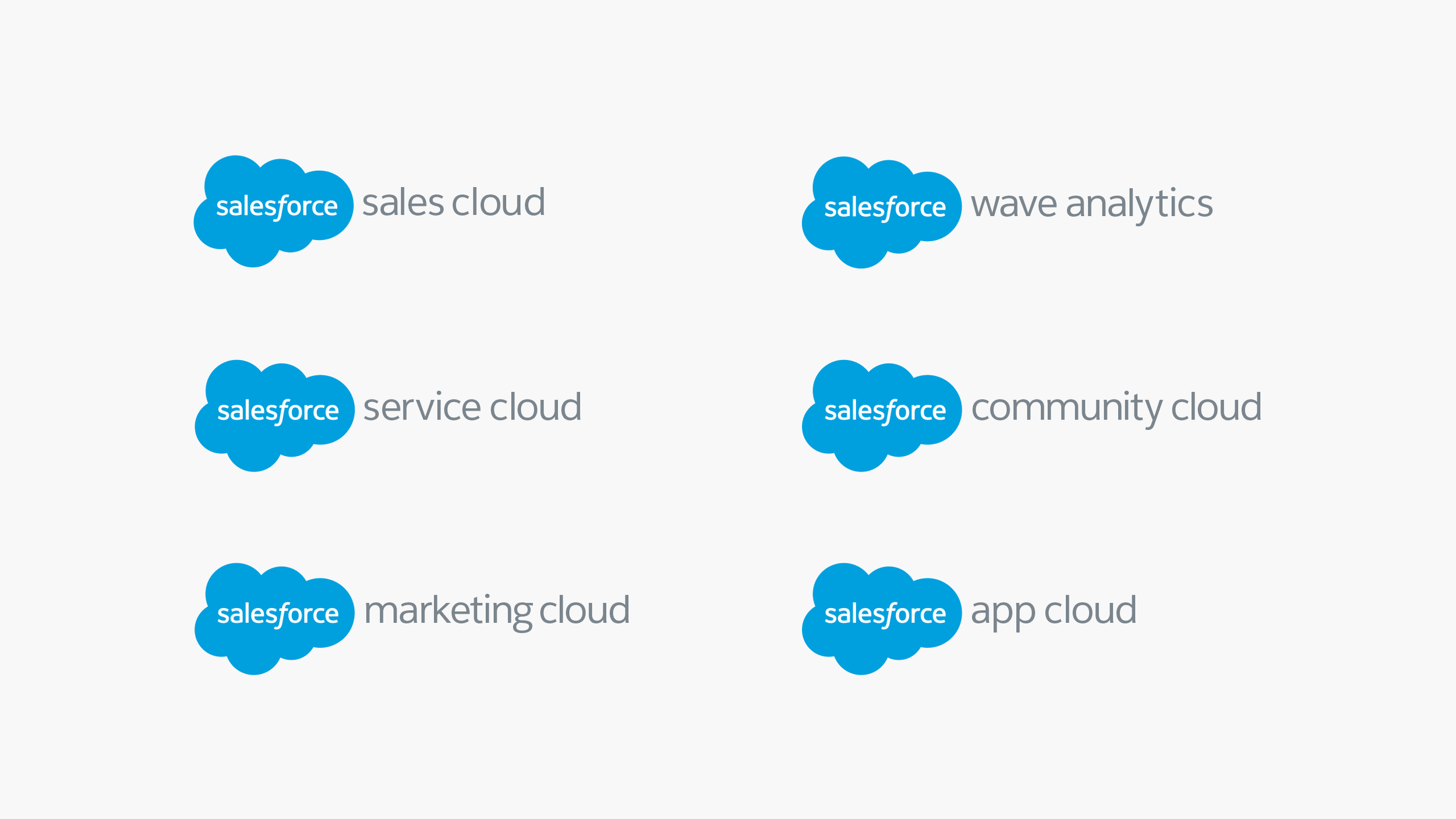
Salesforce Brand Refresh
As Salesforce’s products began to be adopted more widely across the enterprise, the company sought to move from its B2B technology aesthetic and embrace a more consumer-like look and feel. I was part of the team at Tolleson that was asked to refresh the brand ID and architecture to deliver on the promise of customer success and retake ownership of its pioneering position in the cloud. Following a redesign of the logo, we developed a complementary typeface, Salesforce Sans, that reflected the open and friendly attitude of the company. The proprietary Salesforce font was designed to unify the brand from product UI / UX to marketing communications and Dreamforce events.
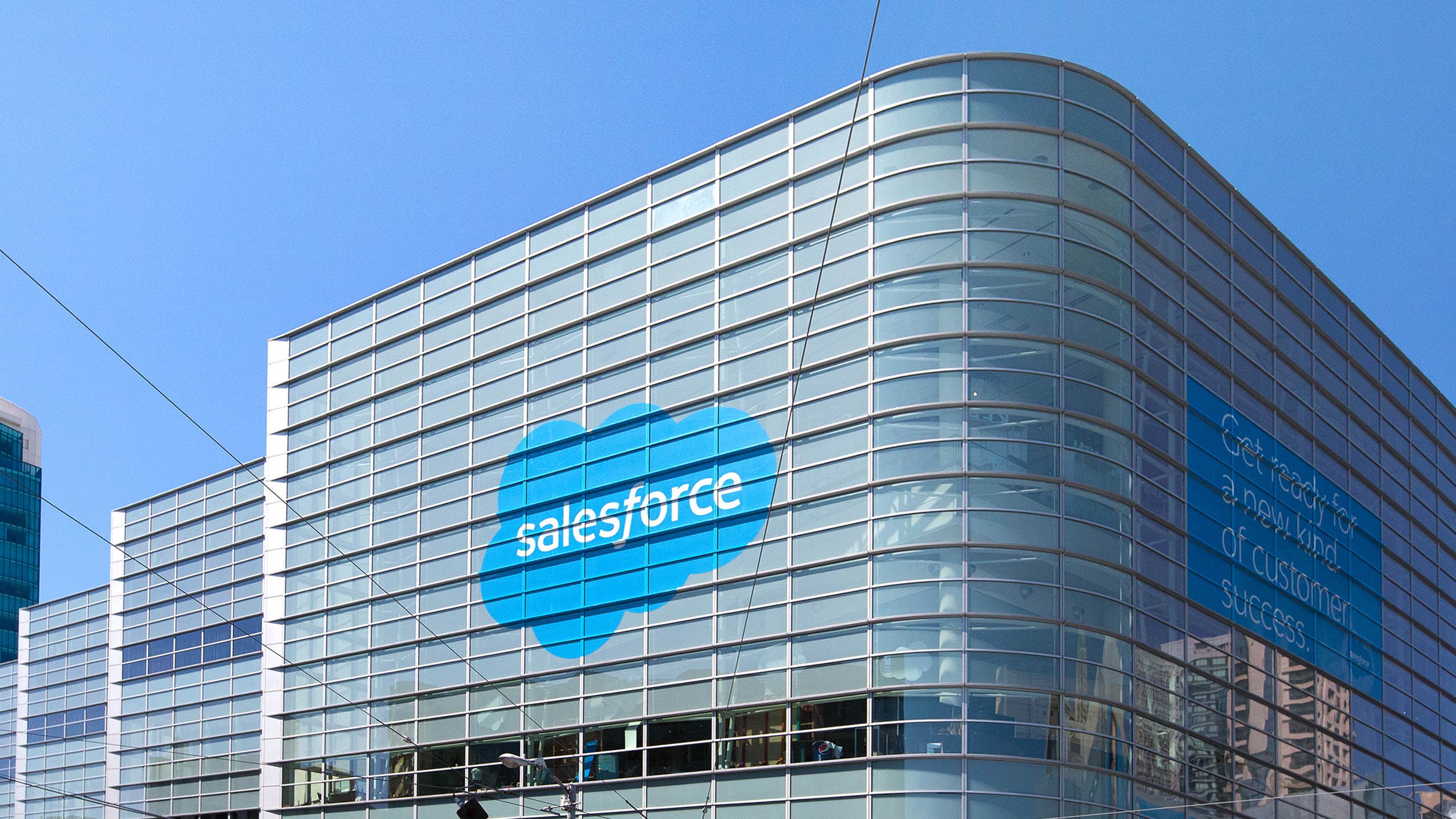
In addition to developing the asset library for the multiple iterations of the identity, I supervised the development, print and installation of multiple signage and environmental graphics projects.